I recently decided I was going to draw a series of comic strips called
Scream Phoenix following the activities of Phoenix Jones, the costumed activist ("real life superhero") in Seattle. For this piece,
I watched a couple youTube videos and picked out a line I wanted to
dramatize and launched right into it...
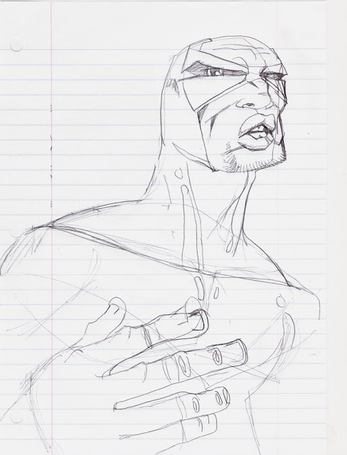 |
| Not in MY City... Step 1- ballpoint pen on notebook paper | |
|
I'm not the type of artist that does every piece the same way. I like to have a million different methods I can choose from at any given time, so that drawing doesn't get boring. I have a really high comfort level drawing on cheap paper, so I just broke out a plain spiral notebook and a #2 pencil and started sketching while I watched a youTube video of Phoenix Jones giving an interview on a local teevee station.
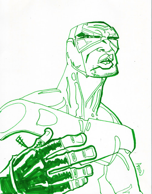 |
| Step 2- Lightbox w/watercolor marker |
After I'm happy with the rough pencil drawing, I put it on a
lightbox and redraw it with a
water based brush pen on a piece of bristol board.

I resisted getting a lightbox for a long time, but now I swear by them! I have a big expensive one at work, and I bought the one I used for this
on Amazon for like forty bucks with a gift card I got for Christmas. It has since paid for itself ten times over. Anyways, I like lightboxing because I draw mad sloppy and I hate erasing and smudging and all that. This way, I get to be as wild as I want to get any movement and gesture in the piece, but still have a nice clean drawing at the end. When I'm making a drawing for someone, I usually do it this way, so they can get a nice clean piece on bristol, not a ratty old piece of computer paper or torn out notebook page.
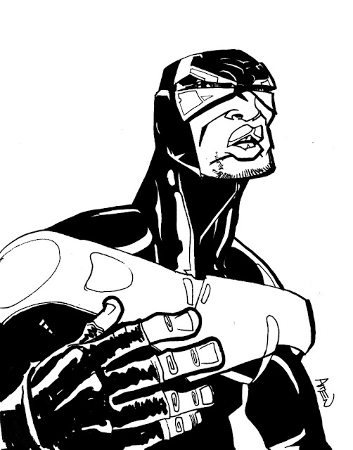 |
| step 3- "inks" |
Anyways, as you can see above, I used a green marker. I like drawing with colored markers even when I plan to deliver a black and white piece.... I create a traditional inked look by scanning it into photoshop, desaturate it, and messing around with levels and/or brightness/contrast. Sounds complicated, but it's not. Then I use the paintbucket tool to fill in all the areas that need to be pure, flat black. At this stage, I usually fix things that are out of whack, but this drawing was pretty trouble free. After I have the inks how I want 'em, I click on a black area with the Wand tool then choose Select > Similar so I have ALL the black artwork selected. Then I created a new fill layer of just the black and call it "lines" or "black" or something like that. Then I create a layer under "black" and make it all white. It hides any marks from the layers beneath it, so all you see is the clean black artwork above.
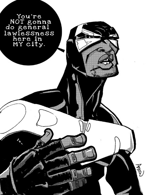 |
| step 4- tones & lettering |
So this could have been shown as two separate steps, but I did it pretty quick since there was only one word balloon. I used the elliptical marquee tool to make a circle, then used my beloved polygon lasso to add the tail and created a fill layer. Then I added the text on top. The font is called "Love Ya Like a Sister" which you can get free online. Just use the magic power of Google.
For the tones, I created a layer called "gray" and put it between "black" and "white" layers. Then on gray I color the artwork in gray tones. The black layer is on top on a separate layer so even I can't mess it up. Once I'm done, I go to Filter > Pixelate > Color Halftone and it creates a halftone screen, which looks just like zipitone ben day dots. If you set the channels on the dialog box that pops up to all the same number, it will be a monochrome screen.
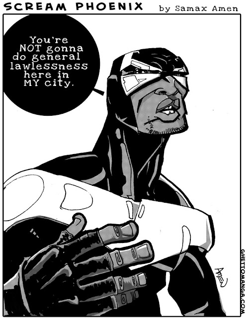 |
| Step 5- final strip |
So here's the final joint. My name is also in that
Love Ya Like a Sister font, and the strip title and my url are in
Creative Block which is a free Blambot font. If you're gonna letter digitally at any time in your freaking life, you need to get familiar with
Blambot.com. That's all I'm gonna say.
You can read the blog post I wrote to accompany this comic here.
peace,
-samax
Ziontific.com


No comments:
Post a Comment